Kinetic typography lyric videos
Kinetic typography makes the words of a lyric video move with the song: timed to the vocal, sized by stress, moving to the beat. How it works, with examples.
Updated
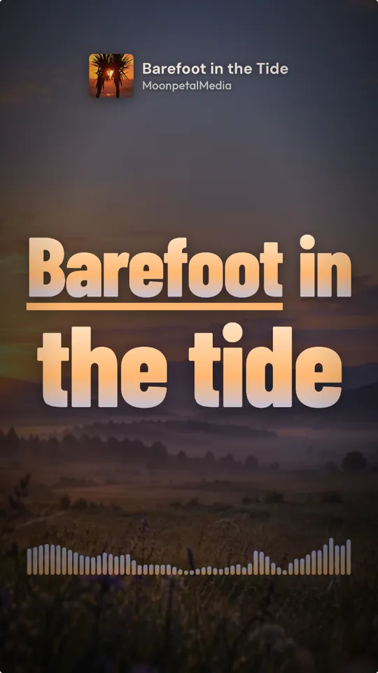
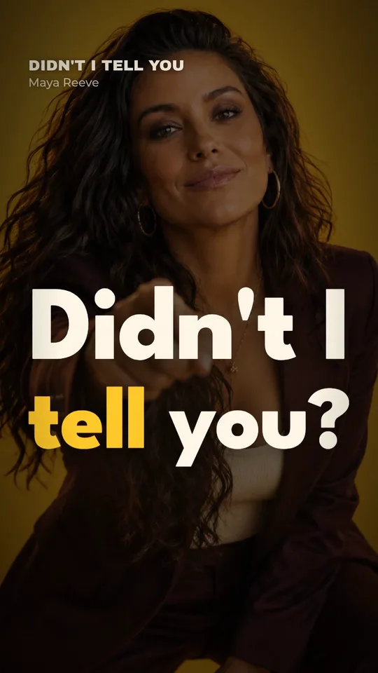
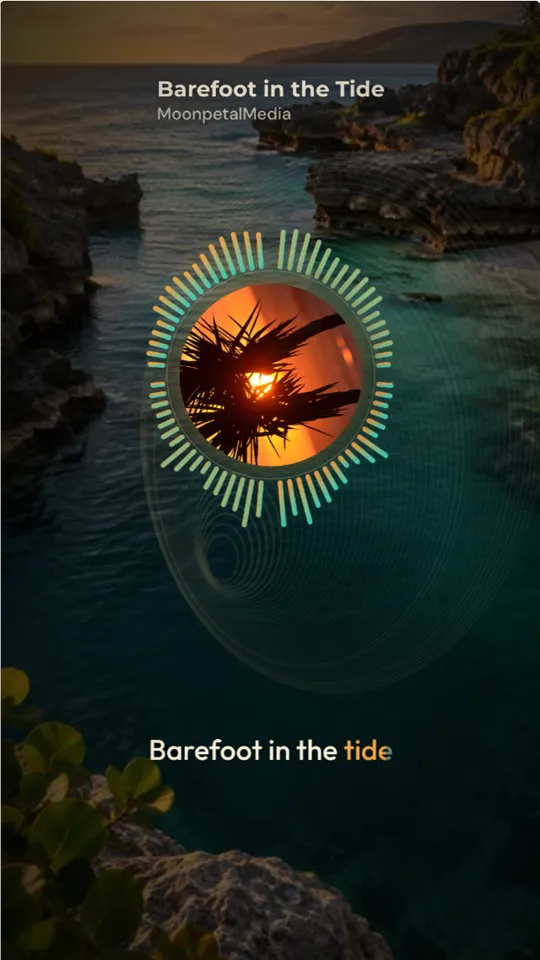
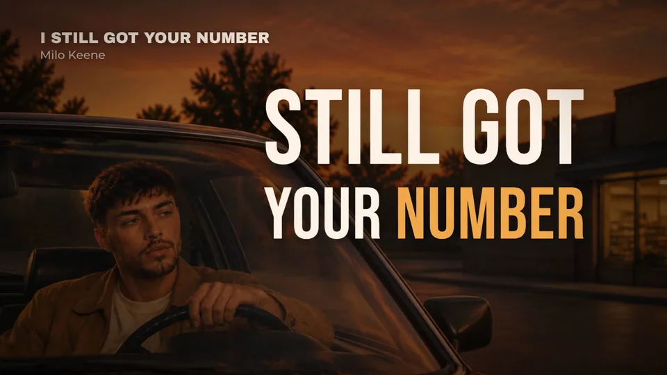
In most lyric videos, the words sit on top of the picture. In a kinetic typography video, the words are the picture. They arrive on the syllable, grow on the word the singer leans on, shake on the snare, and pile up as the chorus builds. Done well, people who've never heard the song can feel where it's going just by watching the type.
What makes it work
1. Every word on its syllable. Kinetic type lives or dies on timing. A word that arrives a frame late looks like a mistake; a word that lands on the consonant feels like it was sung onto the screen. This is why it's so slow to do by hand: you're timing hundreds of words, not dozens of lines.
2. Size follows stress. The singer doesn't give every word the same weight, and neither should the type. The word they hold, the one they shout, the one the whole line is about: that one goes big. "Little" words (the, and, of) stay small and quick.
3. Motion follows the music. Words slide in on a pickup, punch in on a hit, drift on a pad, shake on a distorted guitar. Pick a few motions and keep them; ten different effects in one video is noise.
4. One idea per line. Stack a line so it reads as one shape, then clear the screen for the next. A screen full of every word sung so far is unreadable.
5. It still has to read. It's a lyric video first. If people can't read the line before it's gone, the motion is too fast, the type too thin, or the background too busy.
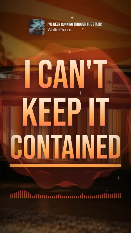
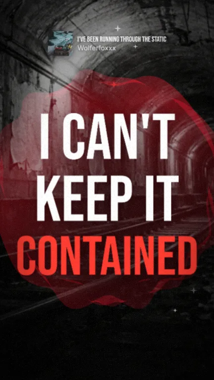
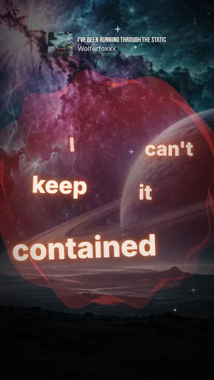
Kinetic typography, by style
Kinetic typography isn't one look. It's a family of ways for words to move. These are the lyric styles Kinetune makes now; each links to its page with a live sample on a real song:
- Showcase
- Block stack
- Punch
- Depth scatter
- Neon
- Terminal
- Cinematic
- Player
- Lo-fi
- Zine
- Glitch
- Pop art
- Dreamy
- Chrome
- Visualizer
- Minimal
- Outline
- Messages
- Vinyl
- Album
- Retro TV
- Cube
- Boombox
- Phone
- Glass
- Embers
- Ink
- Smoke
- Stardust
- Drip
- Rainy window
- On screen
- Behind
- Big type
- Chant
- Doodle
- Highlight
- Smear
- Twin
- Marquee
- Gilded
- Sparkle
- Flare
- Circuit
- Spark
- Loose
- Whisper
- Tiles
- Nested
- Pair
- Tall
- Baton
- Mixtape
- Trail
- Caption
- Focus
- Hush
- Dusk
- Murmur
- Steel
- Sway
Some styles put the words in the scene instead of over it: behind you, on a screen in the shot, or on a phone. Others are pure type on color. For loud, fast songs, the heavy styles (big type, block stack, punch) keep up; for slow, open songs, the airy ones (depth scatter, dreamy, stardust) give each word room.
By hand
The classic way is After Effects: a text layer per line, markers on every word, keyframes for scale, position and opacity, then easing on each. Templates help with the motion, not the timing. Budget a day or more per song, more for long or fast songs.
The faster way
Kinetune hears the vocal and times every word itself, then a Look sets the motion: one of 61 lyric styles, plus colors, type and the background. The motion lands on the beats and sections it finds in the song, and each shape (9:16, 16:9 and 1:1) gets its own layout. Hear your song in a style before you make anything, then see the price:
A lyric video of a 2:47 song, one format
- A Look you already have45credits≈ 30¢
- A new Look, AI image75credits≈ 50¢
Dollar figures at Pro’s monthly price, 0.67¢ a credit. Yearly plans cost less.
New to lyric videos? Start with how to make a lyric video.